In this task we had to create a video game interface for a car game and I had to use what I have learn to design and create a high quality and professional look for my game I got help doing this by looking at other professional looks in the industry. I did create a high standard interface through the work I did and it looks functional, it could be used in a real game.
I started development on my game interface by researching other games in which have a slick clean interface in which isn’t over crowded by unnecessary parts to the interface. This helped me as this is the style I wanted to go for to make my interface look as professional as possible, I looked through different games such as forza and burnout paradise to seek inspiration for my design. I liked how forza looked with it’s professional look adding a more pleasing look to the game.
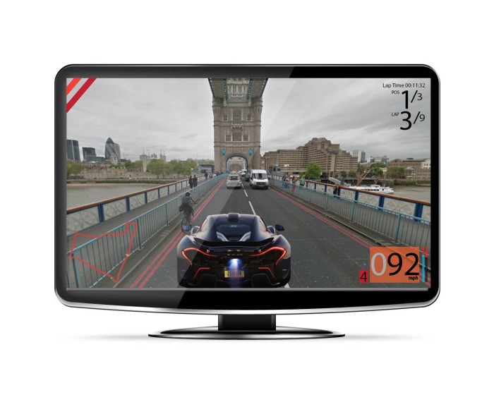
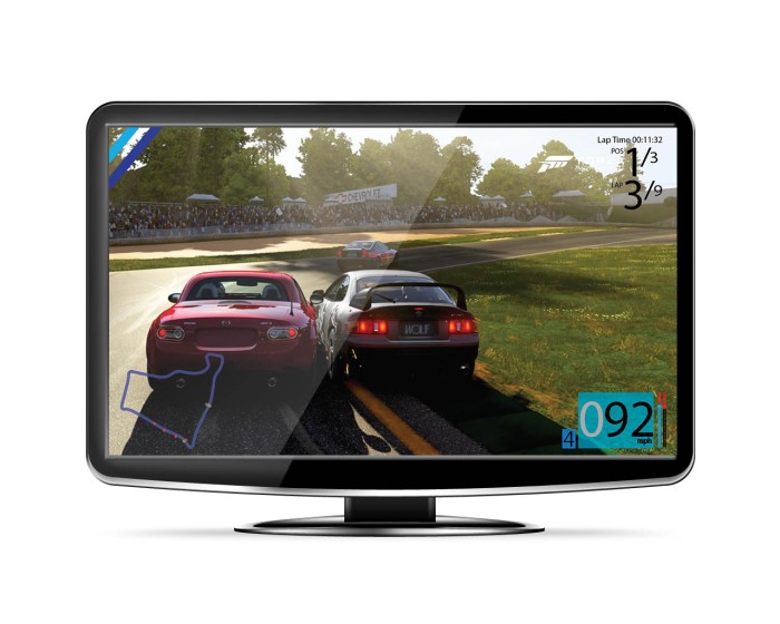
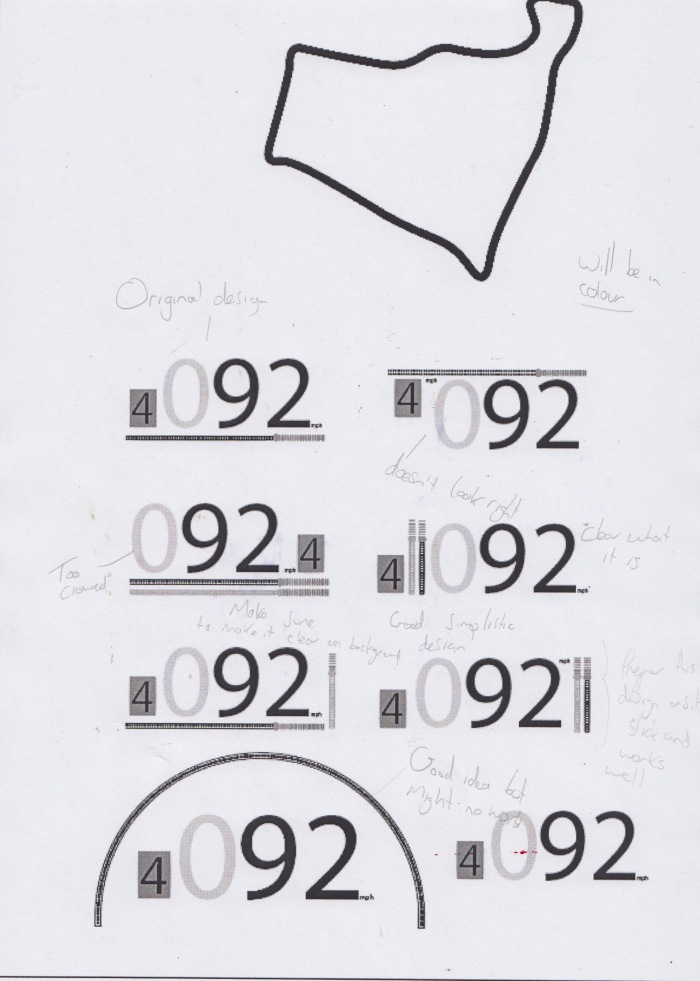
Throughout the development and planning I have come up with something that looks eye pleasing. Starting with the speedometer, I feel the overall look and the effort I put into it really paid off as it what I wanted it look like at the end as its minimalistic and has has a sort of modern feel to it as it only show you what you need to see nothing more nothing less, the speed in (mph)/speed in a rev meter which is blue to show when the max speed is and also works as a boost mechanic. There is also pow er meter/fuel gauge in which displays how much fuel your car has the lower your gauge the more likely you’ll run out of fuel and get reset at the starting line which will be a consequence for not grabbing fuel around the map, I love how this looks as it shows clearly how much power you have/speed clearly and I feel looks visually pleasing as the minimal look to it makes it look modern. Also the backing helps out line the speed so it is easier for the player to check it whilst playing. Finally the gear stick, I know electric cars do not need/have a gear stick but its just to
  for look and will change when you need to change gear automatically but for the people that have a steering wheel/peddles that work with games they will be able to use the gear stick to change the gear if they want to I feel that by doing this it add more control to the user whilst playing this game, plus the colour of this changes depending what team you are on helping show what team you are on. I went through lots of different designs to get this final look and feel that it really can through for me. Next the team colour, to differentiate the teams I added two strips of shade from the same colour to show the different teams. I like the look of this as it simple and doesn’t
 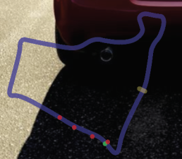 take up a lot of the screen so you have full view of the game whilst still knowing what team you are on. Next is the lap time and position you are in, I wanted to keep this simple and easy to read as the player is concentrating on playing the game the are only going to glance at the this so I wanted to keep it easy to read and at a top corner, this helps keep play on the game reducing the risk of a crash in game unless your driving whist play the game which I don’t recommend. Finally on the interface is the map, the map is from a birds eye view to show where all racers are at each part of the race. The map is also the colour of the team you on also to help show what t
 eam you are on if your stupid enough not to have got the other two hints, the map is slightly see though so you have more view of the map whist playing.
Whist creating the interface I came up with teams with their individual logo, it took a while to come up with ok names for the teams and ended up calling the teams after race horses as I think its quite funny and it fits quite well, but the fourth was a rip off of Red Bull as its called Pink Cows. On a side note I can’t use other well known brands and cars as I would have to pay for the rights to use them in my game and since I’m broke I can’t really do that now back
![]() to the evaluation. I really like the end look I got for the logos, unfortunately I don’t have a very detailed as I’m not that great with illustrator to make t
to the evaluation. I really like the end look I got for the logos, unfortunately I don’t have a very detailed as I’m not that great with illustrator to make t
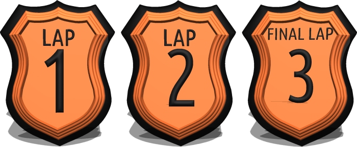
 he super professional so I made them look like they where for horses. I also made a pop up when you finish a lap to tell you what lap you are on, I like how they look as I went for a shield look and it came out well I wou
 ld of like to make each lap a different colour but I wasn’t quite sure how to do that fortunately I doesn’t really impact the look of the shields the its fine.
Overall I feel that the look and the way my interface turned out was good the style and feel I went for where what I ended up with. Maybe I could had detailed so parts more but for my ability I think it turned out well.